Rental timer for Clover point of sale devices
Merchants using Clover POS devices needed a seamless way to track and bill for time‑based rentals, especially in the sports simulator market – without disrupting checkout workflows.
Designing within an existing UI
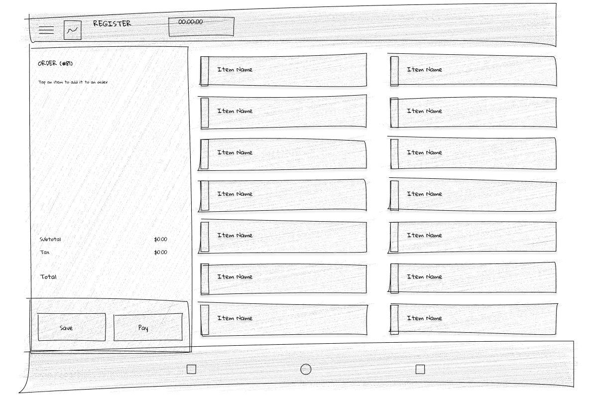
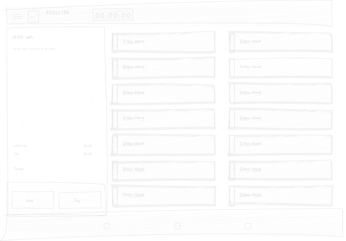
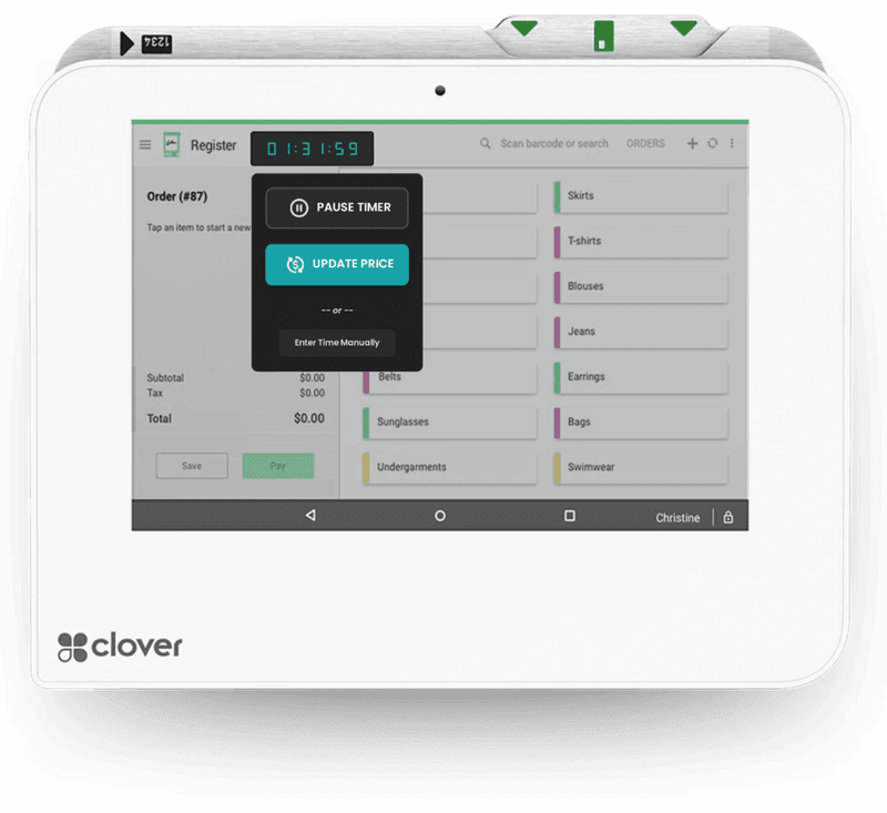
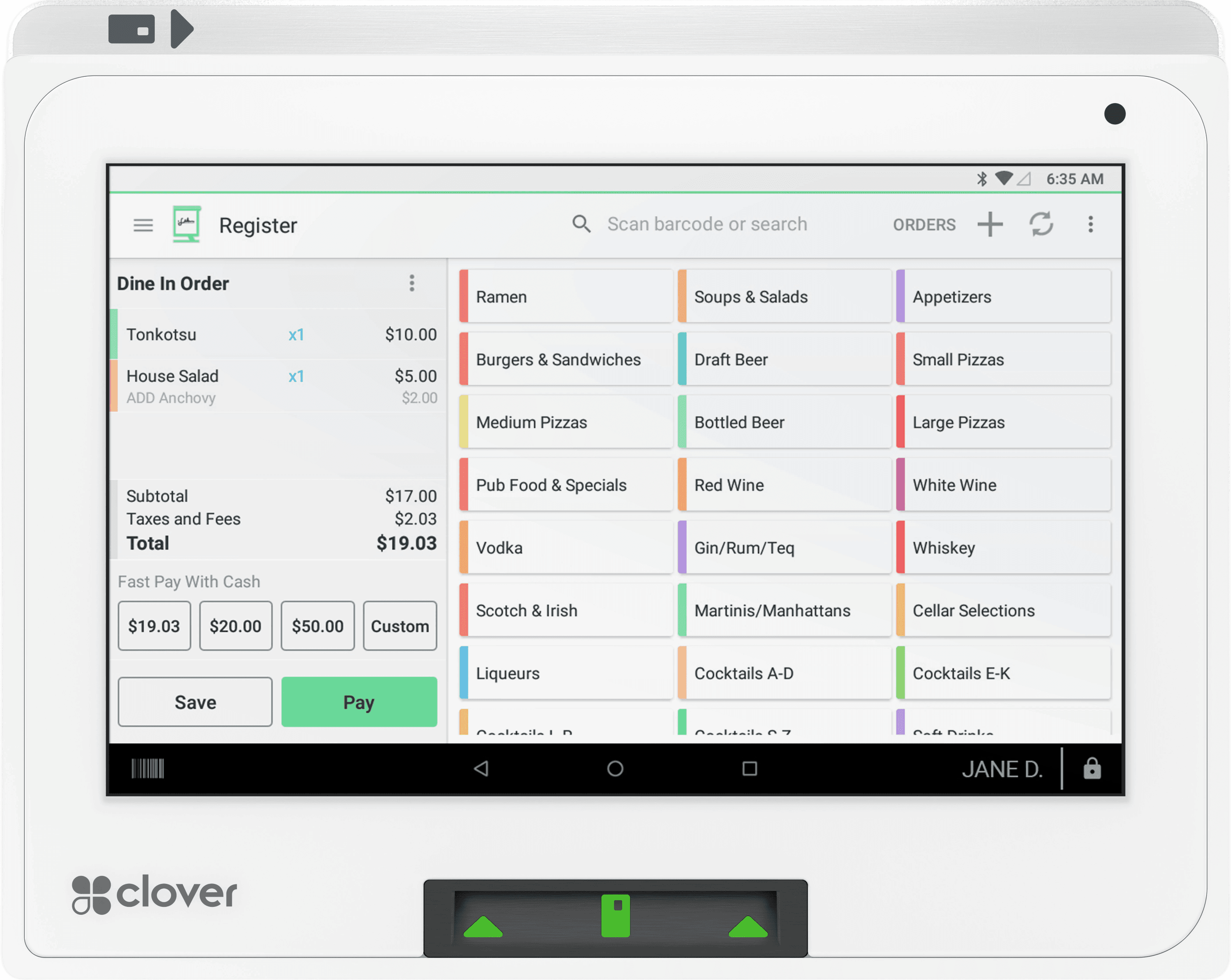
Clover point‑of‑sale devices have a very established and recognizable UI, and this project required building a series of buttons, drop‑downs and overlays for a specific screen within the Clover merchant software – the order screen. This is the most utilized screen by any brick‑and‑mortar business and it's the core function of Clover devices. Blending in and not disrupting the existing workflows, while adding much‑needed functionality, presented a unique challenge.
A tale of un-captured revenue
The traditional manual entry method led to habitual rounding down by time‑constrained staff members at checkout. For example, a customer used 53 minutes of rental time at a local golf simulator but was rounded down to 45 minutes (0.75 hours) instead of calculating the correct 0.883 hours. The business lost 15.06% of earned revenue as a result of the inefficient billing system.

User interviews
The users were bartenders working across all three locations. I asked them to show me in real‑time on our POS system how they entered bay time for customers in a specific scenario:
A customer reserved a golf simulator for 30 minutes, but ended up staying for 53 minutes – show me how you would enter the bay rental charge in the POS.
- Entry Method #1: 66% would round down to the nearest quarter hour
- Entry Method #2: 22% used the provided calculator to get the correct quantity
- Entry Method #3: 12% thought entering "0.53" as the quantity was correct.

Orders with time rental items
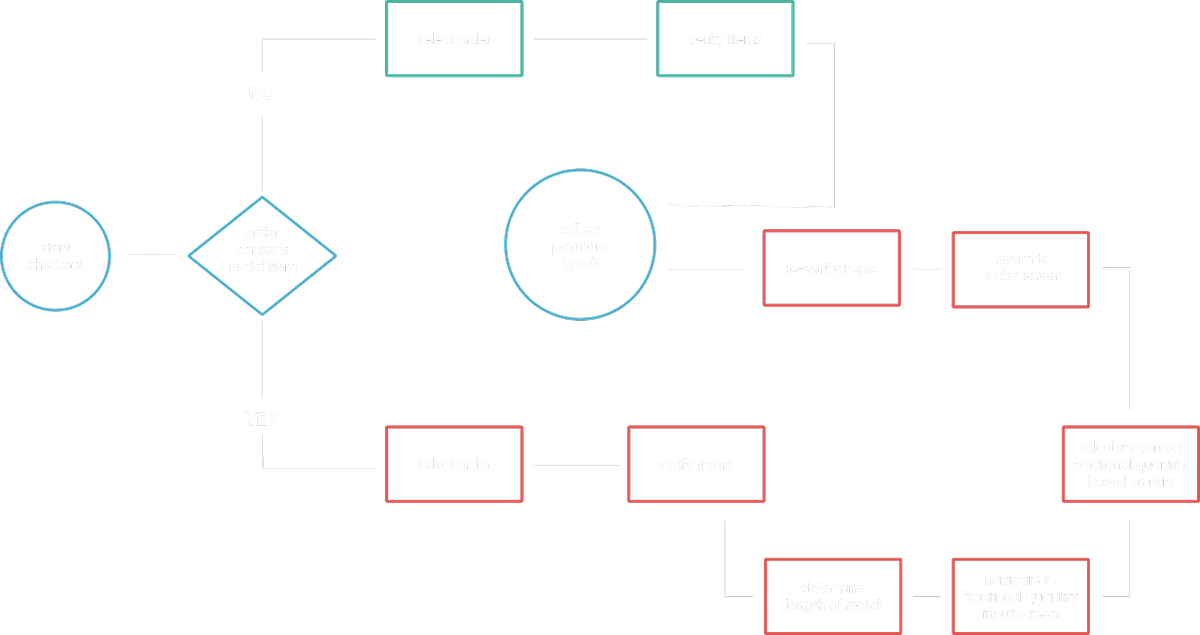
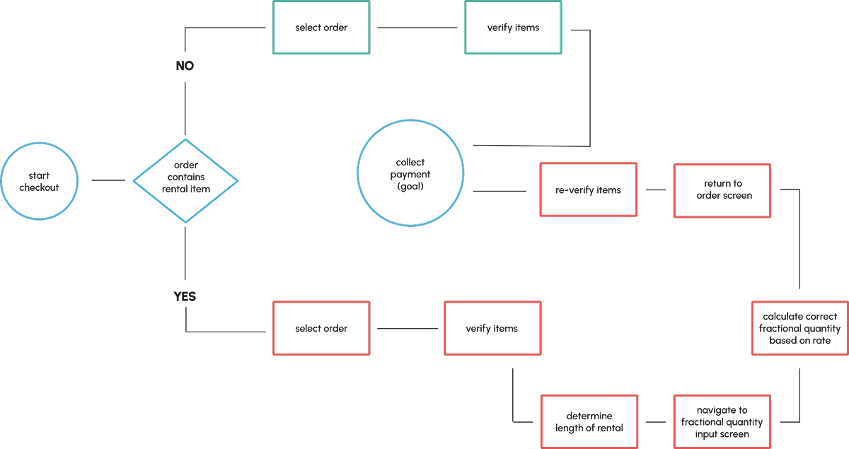
As opposed to fixed price items, bay rentals are fractional per-unit quantity based items, and entering them forced the user to a secondary screen where manual calculations were needed to complete the task. Add on the two people snapping at you for another espresso martini and the old man asking you why he doesn't hit his driver 300 yards on the simulator... I'd probably just round down as well.
Designing a better system
My non‑negotiable was that every function must be accessible from the main order screen. I studied the Clover order detail layout to integrate my solution without hindering existing functionalities. I needed to design a system that could handle all rental tracking, automate fractional time quantity calculations, and blend in to an already crowded point-of-sale order screen.
A FAB idea
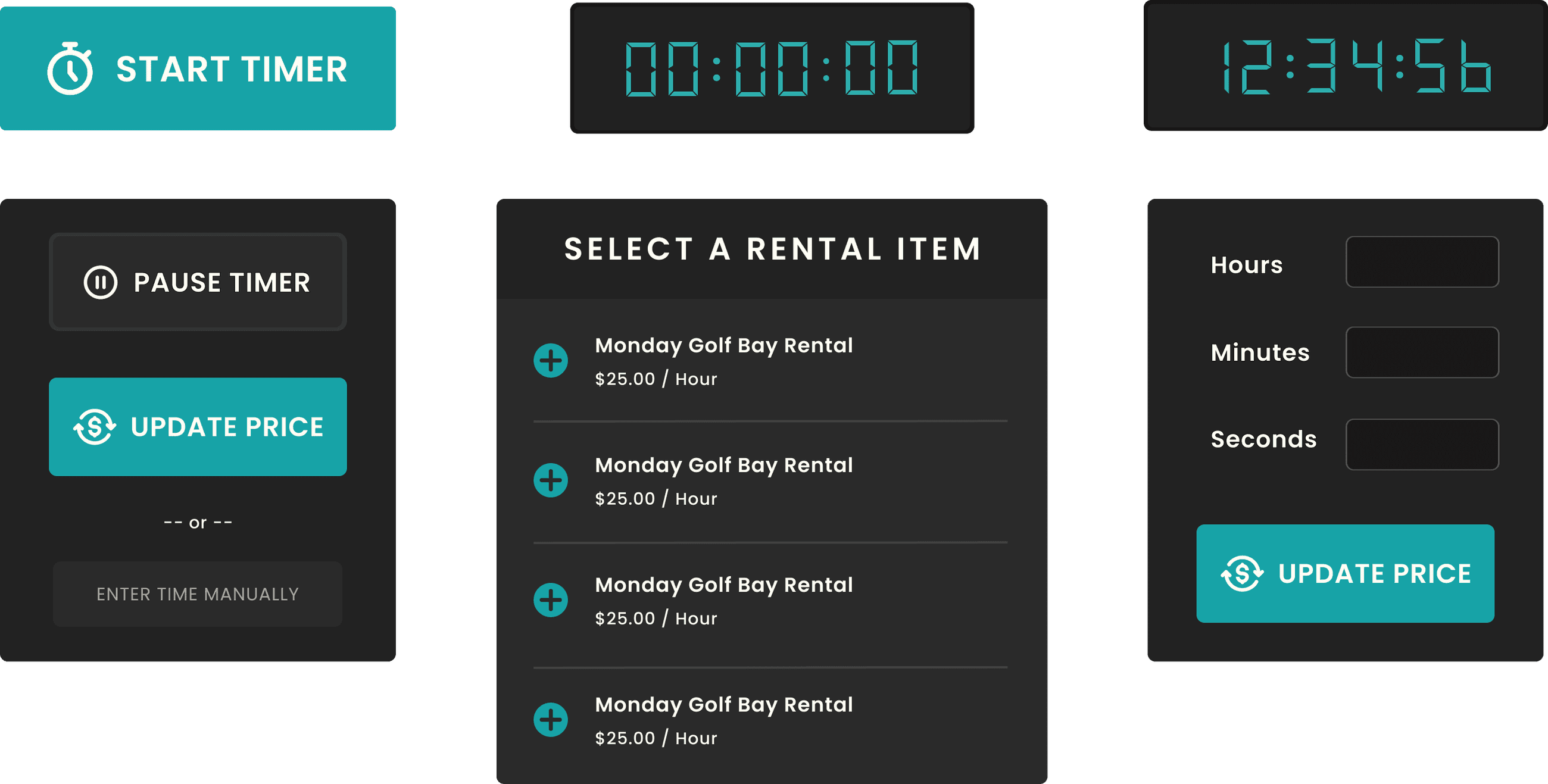
That's a tall order, but through context‑aware design, state management, meticulously designed FAB's and a series of actionable overlay components, I was ultimately able to accomplish the task at hand.
Making it work
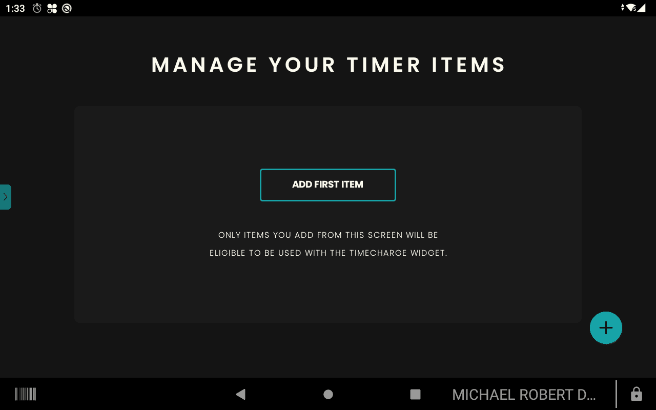
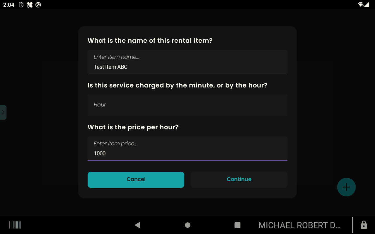
At this point, I've designed a few buttons and determined their placement on the order screen. Now it's time for system design: What happens when the user clicks "START TIMER"? How do we differentiate rental items? I developed a one‑time on‑boarding process to configure timer‑eligible items without disrupting inventory workflows. A simple form allowed users to name the item, select minute/hour unit type, and set a rate.
The business logic
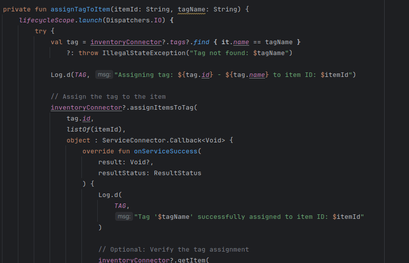
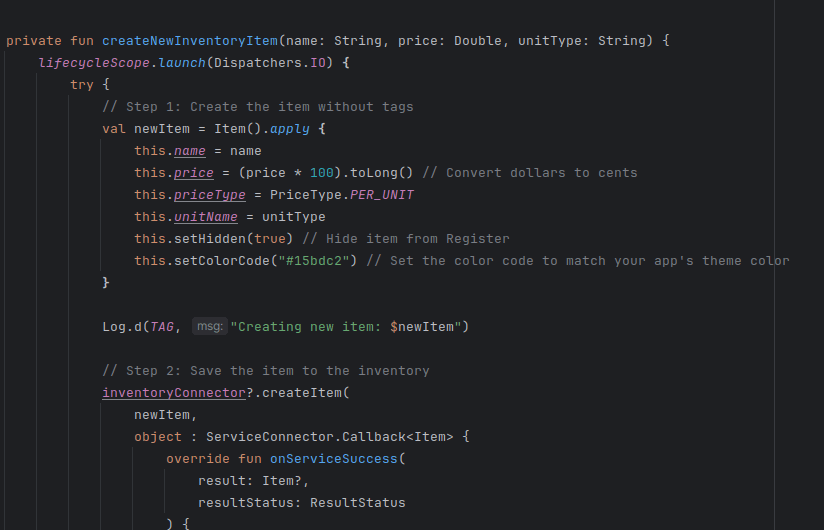
When users create an item in the TimeCharge full app UI, a developer ID tag is attached in the background. This allows conditional display of timer‑eligible items from the order screen FAB. Simultaneously, the 'hide from inventory' function (set to true) ensures that timer‑eligible items appear only in the "START TIMER" FAB.
FAQ & customer support
A clearly indicated drawer slide on the left provided quick access to FAQ and support. The affordance design with right facing arrow was well perceived by the end users.
The app in action
The video below shows a user completing what used to take 60 seconds or more in less than 7 seconds. I streamlined the workflow so all required inputs could be completed from a single screen.
Professional overview
UI/UX & Product Design:
"Good design is obvious, great design is invisible." This theme recurred as I designed, re-designed, and re-developed this application to blend into the existing infrastructure while adding extensive functionality. Countless hours of debugging, coffee, and frustration went into it.
Engineering Technical:
State management was critical – ensuring timers ran continuously and maintained state in the background was a challenge. Integrating with an existing POS system required creative workarounds to hide timer items from the inventory screen while still making them available in the "Start Timer" drop‑down.
